80% of visual communications in digital marketing lose effectiveness due to template monotony and visual noise, according to an Adobe study. Standard fonts, even the most technologically advanced, cease to act as a differentiation tool: users increasingly disregard banal visual solutions, and brands face issues of recognition and emotional response.
Why do some logos and advertising campaigns become instantly memorable, while others fade into the stream of content? How can you create a unique visual code that not only stands out but also conveys company values, increasing the ROI of marketing activities?
I am convinced that lettering is not just an artistic inscription, but a strategic tool capable of radically changing brand perception and its market position. BUSINESS SITE’s practice has repeatedly proven that custom inscriptions created for client needs increase audience engagement, build loyalty, and ensure visual consistency across all points of contact. In this article, I share experiences, best practices, and tools for implementing lettering in web design and digital marketing, as well as discuss risks and effectiveness criteria. If you want to understand how lettering can become a growth driver for your brand, I recommend reading to the end.
What is Lettering?
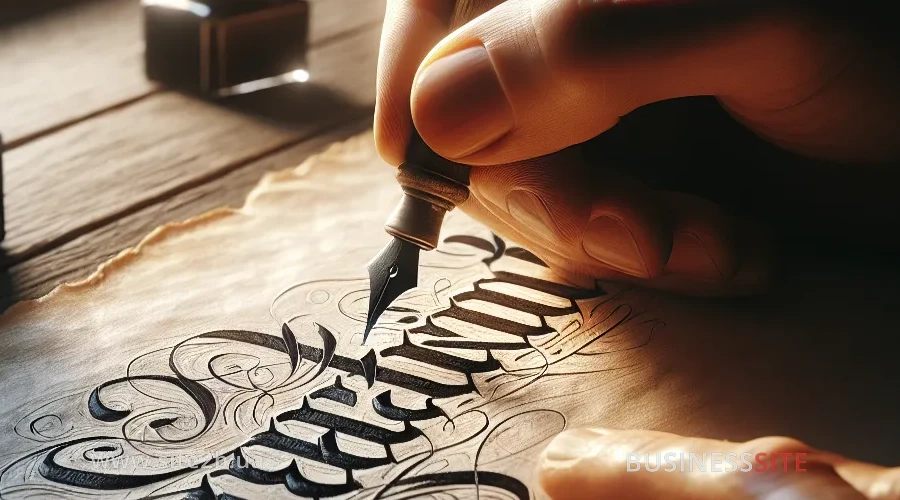
Lettering is a technique of drawing letters where each letter is created manually or with the help of digital tools to form a unique artistic inscription. Unlike standard font setting, lettering turns text into an illustration, allowing the brand to obtain an individual visual code, not just an inscription. This approach provides brand customization, where each line, curve, and decorative element contributes to forming brand identity and visual metaphor.
In my experience, it is lettering that becomes the foundation for creating a corporate style that cannot be copied or reproduced with ready-made fonts. This is especially important for companies striving for maximum recognizability and emotional audience response.
Lettering in Brand Identity and Communication
Lettering strengthens corporate style through visual consistency and emotional storytelling. A unique inscription becomes an integral part of brand identity, conveying the company’s values and character.
I often observe how custom inscriptions in logos, banners, or packaging evoke associations with creativity, attention to detail, and the brand’s innovativeness among the audience.
BUSINESS SITE’s practice confirms: integrating lettering into visual communications increases audience engagement, enhances trust, and builds long-term loyalty. This is particularly noticeable in the digital environment, where competition for user attention reaches its peak.
Lettering, Calligraphy, and Typography: What’s the Difference?
Many marketers and entrepreneurs confuse lettering with calligraphy and typography, leading to mistakes when developing a corporate style.
It’s important to understand: lettering is the process of drawing letters where each inscription is unique; calligraphy is the art of beautiful writing, and typography is the systematization and selection of fonts for reading convenience.
The choice of tool depends on the brand’s strategic goals: if a unique visual code needs to be created, lettering is optimal; if speed and readability are important, typography; if a handwritten character is needed, calligraphy.
Calligraphy or Lettering, What’s the Difference?
Calligraphy is based on the fluidity and rhythm of writing, where each letter is born in the movement of the hand.
Lettering, on the other hand, is an illustration of letters where the designer draws each form to achieve the desired visual effect. For example, for premium brands that value authenticity and handmade work, I often recommend using hand lettering, and for corporate communications, calligraphic elements that emphasize traditions and continuity.
Typography or Lettering, Differences and Examples
Typography ensures convenience and standardization but is limited by the frameworks of existing fonts. Lettering, however, allows for creating creative concepts that cannot be realized with standard fonts.
At BUSINESS SITE, we integrate lettering into typographic projects when visual differentiation is required: for example, for product packaging, promo pages, or digital banners. This approach enhances the composition of the inscription and the adaptability of the design to different media.
Quality Criteria for Brand Lettering
Quality lettering is defined by four main parameters: uniqueness, craftsmanship (or customization), compositional integrity, and readability. These criteria are critical for the effectiveness of brand communications and the formation of a positive user experience (UX).
In my practice, I always emphasize: even the most beautiful inscription loses its meaning if it is difficult to read or deviates from the brand’s overall visual system.
Manual and Digital Lettering for Brands
Manual lettering is the maximum customization and feeling of a “live” brand but requires time and high qualification.
Digital lettering, created using tools like Adobe Illustrator or Procreate, allows accelerating the process, ensuring design adaptability, and scalability for different formats (from logo to digital banners). BUSINESS SITE successfully employs both approaches depending on the tasks: for pharmaceutical companies, we created digital lettering for packaging, and for online stores, hand lettering for seasonal promo campaigns.
Composition and Readability of the Site
Grammatical composition of the inscription is the key to making lettering work for recognition, not creating visual noise. I recommend using modular grids and A/B testing: for instance, testing different lettering options on landing pages or in email newsletters to assess engagement and CTR. This approach ensures visual consistency and optimizes user experience.
Lettering Styles for Web Design and Marketing
Lettering styles are diverse: graffiti, vintage, gothic, mixed techniques, 3D, silhouette solutions, inscriptions with background or decorative elements. The choice of style depends on the target audience, brand positioning, and digital campaign goals.
In my experience, the style of lettering directly influences the emotional response and brand recognition: for youth products, the graffiti style is effective, for premium: gothic or vintage, for technological companies, 3D, or mixed approaches.
Thus, a thoughtful selection of the visual style of letters becomes an important strategy for successful communication in any digital environment – we will further explore the features of graffiti, vintage, and gothic styles.
Graffiti, Vintage, and Gothic in Lettering
Graffiti style is associated with energy, freedom, and creativity: it is often used by brands oriented towards youth and streetwear. Vintage lettering suits companies wanting to highlight traditions or evoke nostalgia. Gothic style is chosen by premium and high-status brands aspiring for exclusivity.
In one of BUSINESS SITE’s cases for a construction company, we applied vintage lettering in the design of banners and souvenir packaging: this solution enhanced recognition and emotional response among the target audience.
3D Lettering and Modern Styles in Digital Marketing
3D lettering allows creating striking visual solutions for digital campaigns, especially in social networks and on promo pages.
Mixed styles (for instance, combining lettering with illustrations or photographs) open new possibilities for creative concepts. At BUSINESS SITE, we actively implement such approaches in UI/UX design for online stores and service platforms, allowing adaptation of the corporate style to different media and formats while maintaining visual consistency.
Lettering in Marketing: Why and How to Apply
Lettering is a powerful tool for brand differentiation that helps stand out among competitors and increase the ROI of marketing campaigns. According to Nielsen’s research, custom inscriptions in logos increase brand memorability by 37% and audience emotional response by 22%.
However, the implementation of lettering requires a strategic approach: it is important to assess risks, manage consistency, and measure effectiveness using relevant metrics and KPIs.
Thus, the implementation of lettering is not only an improvement of the visual image but also a tool for forming a strong connection with the target audience; we will further explore how to make your brand truly unique.
Lettering for the Brand: How to Stand Out?
Global brands like Coca-Cola, Lay’s, and Nestle have long used lettering to form a unique visual code. In Ukrainian realities, I observe similar successes: for a pharmaceutical company (our case), custom lettering in the logo and packaging enhanced trust and increased audience engagement. In digital marketing, such solutions are especially effective for banners, email newsletters, and branded products.
Evaluating the Effectiveness of Lettering in the Brand
For evaluating lettering ROI, I recommend using engagement metrics (CTR, time on page), recognition indicators (surveys, brand lift), and direct response (order growth, repeat purchases).
It’s important to consider risks: style inconsistency, complexity of scaling when expanding the product line, copyright issues. At BUSINESS SITE, we build processes to ensure visual consistency and manage these risks: for example, we develop guidelines for using lettering across all communication channels.
Examples of Lettering for Brands and Advertising
Lettering is successfully applied in various media: logos, packaging, merchandise, interior solutions, banners, printed products, even tattoos.
Each format requires its adaptation, but the goal remains the same: to strengthen visual positioning and user experience.
Lettering for Logo, Packaging, and Merch
In a case for an online store, we implemented lettering on branded products and packaging, creating a unified visual code for all points of contact: from the website to delivery via “Nova Poshta”.
For a bank, we developed a series of digital banners with custom lettering, increasing engagement and CTR of advertising campaigns.
For a travel agency, we integrated lettering into interior design and souvenir products, strengthening the emotional connection with clients and increasing loyalty. Such solutions not only work for recognition but also for forming a unique user experience across all communication channels.
Thanks to a comprehensive approach to lettering integration, the brand gains a significant advantage for further development in the digital environment.
Lettering for the Brand in the Digital Environment
Lettering is not just an artistic inscription but a strategic tool that allows a brand to stand out, create an emotional response, and ensure long-term recognizability. BUSINESS SITE’s experience proves: a competent implementation of lettering enhances corporate style, increases ROI of digital campaigns, and builds a loyal audience. I recommend approaching the choice of style and tools consciously, investing in expertise, and not forgetting about evaluating effectiveness and managing risks.
Lettering can become your competitive advantage; use it for brand growth and development in the digital environment.