Within the first 50 milliseconds, a user already forms an opinion of the site and the level of trust in the brand. Research from the Nielsen Norman Group and Stanford shows that more than half of people judge a company’s trustworthiness by the appearance of the website and the usability of the interface, rather than by the company’s actual years in business or production volume. For an entrepreneur this means a simple thing: the interface either works as an asset that sells and reduces the cost per lead, or it creates a hidden “trust tax” in the form of lost revenue.
On audits I often see the same picture: marketing brings quality traffic, ad campaigns are set up, the media plan is calculated, yet conversion is 1.5–2 times lower than expected. In a detailed analysis with the BUSINESS SITE team we almost always find that the root of the problem is not in the channels or the creatives, but in UX psychology: an overloaded screen, visual noise, weak visual hierarchy, unclear CTAs, and an anxiety-provoking experience during payment and form-filling stages.
Applied UX psychology is about managing the user experience as a system: from the first impression and emotional response to a sense of control, safety, and transparency at every step of the funnel. Trust in a site is not born from a single beautiful screen, but from a combination of small signals: neat typography, a logical block structure, clear payment statuses, an honest explanation of terms and fees, and a consistent visual language of the brand.
In digital projects that we have supported for years, competent management of the user experience produced an increase in ROI from traffic by 25–60% without increasing the advertising budget, solely through UX psychology and adjustments to visual patterns.
Visual patterns in UX design – basic concepts
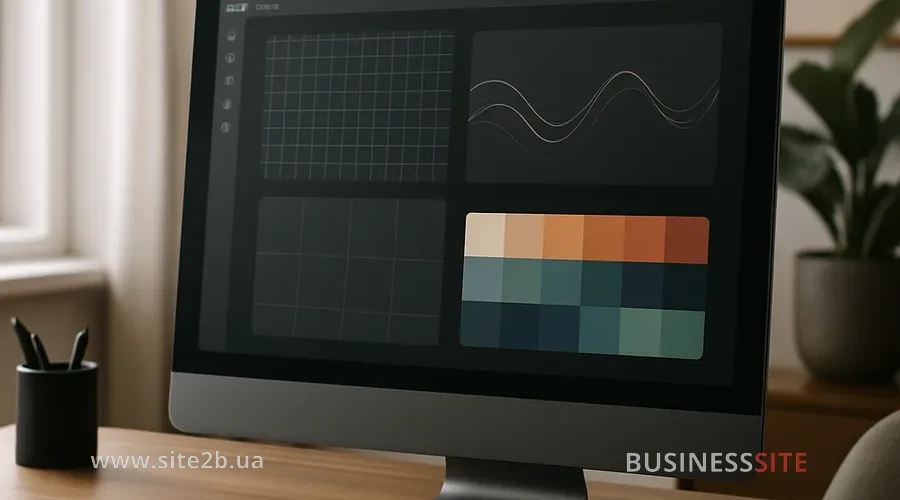
Visual patterns are stable interface solutions that a user quickly recognizes and understands without explanations. Essentially, this is the “visual grammar” of UX design: familiar button shapes, logo placement, menu logic, filter behavior, the structure of a product or service card.
The less the brain “uses up its battery” to understand the interface, the more motivated the user is to continue through the funnel.
From BUSINESS SITE practice, a couple of illustrative groups of patterns that are directly related to trust:
- Navigation patterns. A transparent menu structure, breadcrumbs, predictable filter behavior, clear indication of where the user currently is. In a large eCommerce project where we redesigned the navigation and aligned it with marketplace-typical patterns, the bounce rate on the catalog nearly halved, and the depth of browsing increased by more than 30%.
- Product/service card patterns. A large photo, an obvious CTA, price and payment/delivery terms immediately visible in the first-screen area, a trust block (reviews, guarantees, certificates, license numbers, payment system logos like Visa/Mastercard, logos of PrivatBank, Monobank and trusted acquiring aggregators). For a pharma project, implementing a standardized product card pattern plus emphasis on certificates and usage instructions increased conversion by more than 20% without changes in traffic.
- Form patterns. Minimalist forms with a progress bar, input hints, logical steps and clear error messages. Here the user experience either creates a sense of care and competence, or — chaos and risk.
The key dividing line in UX patterns runs between ethical patterns that help the user make an informed decision and dark UX patterns that aim to “squeeze” the maximum at any cost. For a sustainable business I always support the first option: ethical UX patterns deliver higher loyalty, more repeat purchases and fewer reputational risks in the long term.
Visual hierarchy in UX: managing attention and reducing cognitive load
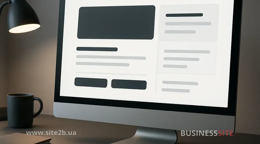
Visual hierarchy in UX is the system by which the user’s eye scans a page and understands what is primary, secondary, and background. We manage attention through size, color, contrast, placement, and typography.
- F-pattern. The user reads the top line left to right, then the second line, and then scans the left-hand column. This pattern is useful on informational pages, blogs, and long landing pages.
- Z-pattern. The gaze moves diagonally from the logo/main heading to the top-right corner, then to the bottom-left, and back to the bottom-right. This pattern is ideal for home screens and promo pages with a single key CTA.
If on the first screen the user simultaneously sees five different CTAs, three promotions, complex animation, and several banners, the brain perceives this as overload and chooses the simple scenario: close the tab. When the interface doses information, logically groups blocks, and suggests the next step, the decision-making process speeds up. The impact of visual hierarchy on conversion is often underestimated, even though it is what turns a “chaotic storefront” into a controlled experience.
Emotional design in UX for trust

I rely on several psychological triggers that work well both in Ukrainian B2C and in B2B:
- Reciprocity. The user receives something useful (a checklist, a calculator, an honest review, a clear tariff simulator) before you ask for contact details. In one project for the financial sector, a calculator with transparent calculation logic and tips about fees significantly reduced anxiety and increased the number of form submissions.
- Imitation (social proof). Reviews, case studies, real figures, partner logos, proof of expertise. Here UX and brand image are closely linked: how you visualize case studies, implementation diagrams, and results affects how much your brand is perceived as “one of us” and competent.
- Scarcity. Time- or quantity-limited offers. It’s important here to follow ethical UX practices: indicate real deadlines, tie scarcity to objective reasons (group limit, remaining spots, production load), and not create artificial hype.
A separate area of work — emotional transitions in UX design. User motivation changes from stage to stage: from interest and curiosity on the first visit to anxiety before payment or confirming a request. The task of UX psychology is to catch these states and build emotional transitions gently:
- before payment, briefly and without pressure remind about the guarantee, return policy, and security;
- after payment, provide a clear success screen with a definite “what’s next” and the ability to quickly contact support;
- in the user account: visualize progress, bonuses, and the status of requests.
Storytelling in design, another tool. Instead of impersonal blocks like “About the company” and “Our services”, the interface constructs a story: the client’s problem → journey → solution → result. When the user “recognizes themselves” in this story, trust in the site and the brand grows much faster than from any slogans.
Microinteractions and transparency: how they build trust

In my experience, it’s these “little things” that most often separate a “normal” site from a resource that is truly trusted.
A couple of practical measures that BUSINESS SITE specialists almost always implement:
- Action confirmation. Adding a product to the cart is accompanied by a short animation and a clear message, submitting a form — an explicit status “request submitted” with information about response times, status changes — a push or email notification.
- Contextual help. Inline hints in complex fields (TIN, card number, account details), input masks, on-the-fly validation, human-friendly error explanations.
- Transparency and honesty in design. The user sees the final price in advance including Nova Poshta delivery, acquiring fees, installment terms from PrivatBank or Monobank. All the “small” conditions are available in one click and can be read without a magnifying glass.
Dark UX patterns: risks and how to avoid them

Dark UX patterns are interface techniques that push the user toward an action that benefits the business but contradicts their real interests or expectations. These include «hidden» checkboxes for add‑on services, pushy subscriptions, difficult cancellations, confusing account deletion methods, and artificially inflated timers.
In our projects, I adhere to several principles of ethical UX:
- all paid options are turned off by default; the user consciously enables them;
- complex legal and financial terms are explained in plain language and visually (icons, diagrams, FAQ);
- subscription cancellation or account deletion follow the same clear user flow as activation.
UX analytics: heat maps, behavioral analytics and ROI
Without UX pattern analytics, any discussion about business impact remains at the level of impressions. I always structure UX research and analytics around three blocks:
- Qualitative behavior.
- heat maps and scroll tracking: where users click, how far they scroll, which elements they ignore;
- session replays: how people actually go through checkout, registration, and payment flows.
Analyzing user behavior with heat maps often reveals unexpected insights. In one eCommerce case it turned out that users were massively clicking a “non-clickable” element, perceiving it as a filter.Correcting the pattern increased product view conversion without increasing traffic.
- Quantitative UX metrics and ROI.
I link UX patterns aimed at increasing conversion to concrete KPIs:- conversion on key user flows (purchase, lead, registration);
- time to first key action;
- percentage of abandoned forms and carts;
- frequency of repeat purchases and usage of the user account.
I propose to answer the question “how to measure the ROI of implementing UX psychology on a website” through A/B tests: compare patterns before and after, calculate the difference in revenue, margin, and cost per lead.In one project delivering goods across Ukraine, reworking the UX of the payment step (managing cognitive load through design, simplifying fields, microinteractions) paid back the design investment in less than two months due to an increase in completed payments.
- Behavioral analytics in conjunction with marketing.
UX and digital marketing are inseparable: segmentation by channels, campaigns, and CRM tags on leads allow you to see which UX patterns work best with different traffic sources. This helps optimize not only design but also the budget.
Scaling UX patterns and digital marketing
When basic UX solutions are validated by data, the next step is scaling UX solutions across the entire product portfolio and regional versions. In the multi-product companies I’ve worked with, the main challenge is to preserve recognizability and brand image while adapting UX patterns for SaaS, B2B and eCommerce taking their specifics into account.
A couple of principles I use:
- Design system and a library of UX patterns.
All successful patterns (product card, application form, tariff screen, personal account) are described as guidelines and components. This makes it possible to quickly scale solutions without “reinventing the wheel” in every project. - Flexibility for segments.
UX patterns for B2B emphasize expertise, process transparency, control and reporting. Patterns for eCommerce focus more on speed, convenience, emotional design and benefit.
Modern technologies in UX: neural networks and automated analysis
UX design and neural networks today: not a theoretical topic, but a working tool. I use AI in three areas:
- Analysis of behavioral data sets.
Neural networks help find patterns in clicks, scrolling, and sequences of actions that are difficult to notice manually. Based on this, you can more precisely tune UX patterns to increase trust and conversion. - Interface personalization.
For different segments (new/returning users, different traffic sources, device type) neural networks select optimal blocks, screen order, and recommendations. This enhances UX and decision-making in eCommerce, SaaS, and service models. - Hypothesis generation and testing.
AI helps formulate variations of texts, microcopy, and elements of emotional design and immediately test them on a small audience.
It is important to remember that neural networks are not a replacement for UX psychology, but an enhancer. The foundation still lies in understanding cognitive design principles, user scenarios, and ethical frameworks. If you feed dark patterns into the input, AI will simply scale up manipulations, which is dangerous for a brand.
UX psychology and visual patterns for trust and business
In my experience, sustainable growth in digital begins the moment an entrepreneur stops viewing design as “a pretty shell” and starts managing user experience as an asset. UX psychology, visual patterns, visual hierarchy, emotional design, microinteractions, rejection of dark patterns, strong analytics: these are elements of a single system that work to build trust in the website and the brand.
When an interface helps a user make an informed decision, reduces cognitive load, shows honest terms and respects time, the business gets more than a one-time conversion: digital loyalty, increased repeat sales, a sustainable brand image, and a more predictable ROI from marketing.
Rate the article: