The average conversion of a product page in e‑commerce often gets stuck in the 1–3% range, although studies on conversion rate optimization show that thoughtful optimization can increase sales by 20–50% without increasing the advertising budget. In my experience, this is one of those rare cases where it’s more profitable for a business to “fix the tap” than to keep increasing the water pressure.
Entrepreneurs and marketers face the same scenario: the advertising budget grows, while ROI stagnates. Traffic arrives at the product page but does not convert into orders. This is felt especially sharply by companies with expensive logistics (delivery by “Nova Poshta”, warehousing costs) and a high customer acquisition cost — every “empty” visit becomes a direct loss.
I often ask clients in initial meetings: if your contextual advertising was turned off tomorrow, how many orders would you retain solely thanks to product pages? In most niches the answer is: “dangerously few”. And that’s despite the fact that the product page is one of the most manageable areas of influence on conversion and LTV.
I am convinced: the ideal product page is not about “looking good”, it’s about 15 specific elements that together drive micro- and macro-conversions: from viewing to adding to cart and payment. These are precisely the elements we systematically refine in BUSINESS SITE projects: from pharma companies to marketplace-oriented online stores. Wherever the team was ready to work with data and A/B tests, we saw product page CR grow by 30–70% and returns fall by 10–25%.
If you want to understand which 15 elements influence sales on the product page, where to start improving the product page, how to assess the ROI of improvements and not “break” seo and UX, it’s worth reading the material to the end. I will unpack the structure, priorities, metrics and risks the way we do in real projects: with a focus on practice, the Ukrainian market and measurable results.
Contents

- How to design a product page: why structure determines 80% of success
- product page: 15 elements that affect sales (priority ranking)
- Optimizing the product page for conversion: A/B testing and metrics
- Checklist for improving the product page, risks and tools
How to design a product card

That’s why the product card—its elements and structure—delivers up to 80% of the optimization effect. Not only the information matters, but the order: what appears on the first screen, how blocks are arranged, and whether it’s easy to navigate the page on mobile. In our experience, restructuring the layout without changing content sometimes gives a +10–15% boost in conversion.
For this I look at the product card through three layers:
- logical structure (navigation, breadcrumbs, canonicalization of duplicates);
- technical layer (speed, mobile‑first, Core Web Vitals and Time to First Meaningful Paint);
- informational layer (rich content, reviews, specifications and trust triggers).
Product schema.org for rich snippets
A separate growth lever is the Product SEO markup (schema.org) and microdata. Structured data allow search engines to correctly understand the product card and show rich snippets / enhanced snippets: price, availability, star rating, number of reviews.
- the Product type;
- the price and availability parameters;
- the aggregateRating block;
- microdata for reviews and star rating for the snippet.
The key principle is consistency. Information about price, availability, discounts and reviews in the markup and in the visible part of the product card must match. Otherwise, the risk of refusals and loss of trust increases.
Pay special attention to how Product structured data affect visibility growth in search: the product card is more likely to appear in results for long‑tail queries (“how to structure specifications and the size chart to reduce returns”, clarifying queries by brand, color, volume), not just for the product name.
Navigation and mobile-first
I suggest looking at this through the lens of page load speed and web performance:
- Core Web Vitals for product pages (LCP, CLS, FID);
- Time to First Meaningful Paint as a guideline: the earlier a person sees the key content (photo, title, price, CTA), the more likely they are to stay.
To simplify practical assessment, I summarize the main differences in approach between desktop and mobile in one table.
| Aspect | Desktop | Mobile (priority) |
|---|---|---|
| First screen | Photo + short description + price | Photo + price + CTA, minimal “noise” |
| Navigation / breadcrumbs | At the top of the page | At the top, but compact, with the ability to collapse |
| Image gallery | Horizontal strip | Swipes, tap‑to‑zoom, optimize media weight |
| Rich content | Long blocks can be used | Collapse into accordions, load on demand |
| Speed | Good if fast | Critical; optimize scripts and images |
BUSINESS SITE practice confirms: when we adapt the product card for mobile‑first (simplify the menu, move the CTA higher, optimize media and scripts), the mobile product card often yields a larger conversion increase (CRO) than any piecemeal text tweaks.
15 elements on a product page that influence sales
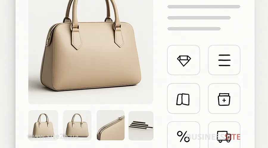
When it comes to the 15 elements of a product card that affect sales, entrepreneurs need to understand not only “what to fix” but also “in what order”. Resources are always limited: budget, team, time. Therefore at BUSINESS SITE we rank elements by their impact on conversion and implementation complexity.
- the top 3 elements provide up to a 60% increase in CR;
- elements 4–10 more strongly affect reducing returns and increasing average order value;
- elements 11–15: about LTV, trust and monetization of repeat purchases.
I will divide them into three clusters.
Visuals and rich content for 40% more views
-
Primary and additional images, video and 3D
In e‑commerce, photos often sell better than text. For a product card on a marketplace this is especially noticeable: the first contact happens through the thumbnail. I use the following basic checklist:
- 5–8 angles of the product (overall view, details, packaging);
- zoomable image (lens) to examine texture;
- aspect ratio and background aligned with the marketplace and the site;
- video review or a short clip “how it works”.
After optimizing primary and additional images, video and 3D for one premium-tech online store we saw a 35% increase in time on the product page and about an 18% increase in the “added to cart” share. -
Rich content of the product card (interactive, configurator)
By rich content of the product card I mean:
- video demonstrations;
- 3D models;
- interactive configurators;
- extended instructions, diagrams, FAQ.
Such rich content / enhanced content works especially well for complex and expensive products (construction, medicine, finance). In one pharma-niche project we added an interactive usage diagram and a “frequent questions from doctor/patient” block: and achieved a 22% increase in product page conversion by reducing doubts.The task is to balance rich content and speed: a balance for product cards. It’s convenient to place video and 3D below the first screen, use lazy loading and a CDN so as not to hurt Core Web Vitals. -
Infographics and labels (marketing markers)
Infographics and labels (marketing markers) allow you to “package” the USP and benefits at a glance:
- “-20% today” (anchor/strikethrough price, a price-psychology bonus);
- “Best seller”, “Top customer choice”;
- icons “Made in EU”, “Eco”, “Non-GMO”.
In one case a home goods business replaced a textual list of benefits with a simple infographic “3 key benefits in 5 seconds”: and the CTR on the “Add to cart” button grew by 9%. -
Zoomable image and gallery of angles
Lack of angles is one of the common reasons for returns. The standard I follow:
- at least 4–5 different angles;
- clear lens behavior on desktop and pinch-zoom on mobile;
- lifestyle photos (“in life”) (more on them below).
-
Visual storytelling (lifestyle photography)
Visual storytelling and lifestyle photographs: these are photos where the product “lives” in a real context: tableware on the table, clothing on a person, a bank card in a real payment scenario, a travel package in the format “I’m already here.” Such scenes:
- reduce cognitive load: it’s easier for the customer to imagine themselves with the product;
- increase emotional engagement;
- often increase average order value through cross-sell (several products shown in one photo).
According to the BUSINESS SITE team observations, adding a lifestyle photo series gives +10–20% to gallery views and a noticeable increase in CTA clicks, especially on mobile.
Text and UTP – reduce returns by 25%
-
Product name and semantics
Product name and semantics: a key element that affects both SEO and conversion. I use the basic formula:Brand + Model/type + Key characteristic + Volume/size + Clarification (purpose)Such a name:
- helps search (includes target queries);
- increases CTR on listings and marketplaces;
- reduces the number of “wrong” orders, and therefore returns.
-
UTP / value proposition (USP) and a persuasive product description
The product description, the persuasive description — it’s not just a “technical manual”. I recommend building it according to UX-writing principles:
- the first paragraph – a short lead text that answers the question “who is this product for and what problem does it solve”;
- then, structured blocks: benefits, how to use, compatibility, answers to common objections.
The task of the UTP is to fix a specific value: time savings, reliability, safety, service. For the B2B segment (for example, pharma or construction) we often add emphasis on certification, supply guarantees, post-sale service. -
Specifications and technical details (size charts)
Properly formatted specifications and technical details (size charts) directly affect returns. In one apparel project we reworked the chart according to three principles:
- added real measurements according to the Ukrainian sizing chart;
- specified the height/measurements of the model in the photo;
- displayed a “how to take measurements” hint as a mini-infographic.
Result: a reduction in returns due to “didn’t fit” by ~18% and increased satisfaction in reviews.Therefore the question “how to structure specifications and size charts to reduce returns” for me is not theoretical but operational. -
Price, discounts, and clarity of terms
The price, discounts and promotional blocks on the product card are a powerful trigger where it’s important to combine UX and price psychology:
- clearly visible main price;
- neatly formatted strikethrough old price (anchor price);
- explanation of promotions in simple language: no asterisks and fine print.
Managers often find it useful to look here not only from the user’s perspective, but also through unit economics: how changes in promotions affect margin and the product card’s ROI for improvements. In some BUSINESS SITE projects we test different discount schemes (percentage, fixed amount, bundles) via A/B‑experiments and calculate the impact on CR and average order value. -
Availability, delivery times, payment options
For a buyer in Ukraine, transparent terms are the minimum:
- current availability;
- honest delivery times (‘Nova Poshta’, courier, pickup);
- convenient payment options (card, Apple Pay/Google Pay, bank installment plans).
I recommend placing this information in a separate block next to the price. In one electronics online store case we added a widget that estimates the delivery date based on the branch index and saw completed purchases increase by ~7% due to reduced uncertainty.
Trust, CTA and Personalization in Marketing
-
Reviews and Ratings, Reputation Management
Reviews and ratings on the product page are one of the key trust signals. Important here:
- number of reviews (social proof);
- average rating;
- quality of moderation (fighting fake reviews, fraud management).
In BUSINESS SITE projects we establish a policy: encourage genuine reviews, promptly respond to negative feedback, highlight useful reviews. The impact of moderation and review-handling policy on conversion and reputation turns out to be much stronger than many expect. -
CTA (the “Buy” / “Add to Cart” button) and its visual prominence
A good CTA button is a combination of:
- contrast (to the color scheme, but within the brand);
- clear copy (“Buy”, “Add to Cart”, “Checkout”);
- sufficient size and spacing, especially on mobile.
We often use A/B tests for microcopy and CTA colors to squeeze a few more percentage points of CR at the micro-conversion level (add to cart). -
Personalization of Content and Recommendations
Personalization of content and recommendations (product recommendations) works on two levels:
- content (show relevant benefit blocks for B2B/B2C segments);
- recommendations (dynamic collections like “Similar”, “Customers also bought”).
For a home goods online store, configuring the recommendation engine and personalized blocks increased the average order value by 12% and increased CLTV over a 6-month horizon. Cross-sell / up-sell blocks also work here, especially if tied to browsing and purchase history. -
Cross-sell / Up-sell Blocks
Smart product bundling and cross/up-sell are:
- complementary products (a filter for a coffee maker, accessories for appliances);
- a more advanced version (up-sell with a justification of the benefit).
An important factor is not to overload the product page. I limit the visible area to 4–6 items, showing the rest via swipe or in a separate modal window. -
Warranty, Returns, Certification
Final block: about risk reduction:
- warranty, returns and post-sale service;
- legal and certification information;
- payment security.
In the pharma and medical case that the BUSINESS SITE team worked on, a block placed in the product page with licenses and a clear returns policy reduced the number of “reassurance” calls to the call center and increased the share of online orders without consultation.
Optimizing the product page for conversion

Intuition: useful, but on product pages I prefer numbers. Optimizing the product page for CRO (conversion rate optimization) happens through systematic A/B testing of the product page.
- I formulate a hypothesis: “If we change X, then Y will increase by Z%”.
- I define the metric: CR to purchase, CR to add-to-cart, CTR on the CTA.
- I use tools (Optimizely, Google Optimize‑analogues, A/B testing platforms).
- I wait for statistical significance (minimum traffic and order volume).
This is what we test:
- CTA copy;
- placement of the price block;
- rich-content formats;
- different description and headline templates.
KPI and analytics: tracking ROI
Managers and finance teams need to understand how A/B testing the product page affects ROI. I look at three levels of metrics:
- micro-conversions: clicks, scroll depth, add-to-cart;
- macro-conversions: completed orders, revenue;
- post-facto: returns, LTV, NPS.
To correctly calculate the ROI from updating product pages, I tie together:
- traffic and conversion data before/after;
- the share of changes attributable to a specific element;
- impact on LTV (for example, through repeat purchases and reduced returns).
- CR to purchase;
- CR add-to-cart;
- average order value;
- return rate;
- time on page;
- viewing depth;
- product page contribution to the purchase path (attribution).
Product page for a marketplace: scaling to 10k+ SKUs
For a business with a large catalog the main question is: how to scale product page templates to 10k+ SKUs without losing content quality and SEO.
I rely on several pillars:
- PIM‑system (Product Content Management) as a single source of product data;
- well-thought templates for different categories (clothing, electronics, pharma, services);
- generation of metadata and portions of content by rules rather than manually.
- optimizing the product page for the marketplace and the company website;
- uniform structure (important for SEO and UX);
- reducing errors when updating prices, availability, and specifications.
Product Card Improvement Checklist
As a final tool, I compile everything into a practical checklist of 15 product card elements that increase sales.
15-item checklist
- Page structure: logical hierarchy of blocks, breadcrumbs, clear navigation.
- Product SEO markup: price, availability, rating, reviews, correct microdata.
- Speed and mobile‑first: optimized images, scripts, Core Web Vitals.
- Main and additional images: 4–8 angles, zoom, correct quality.
- Video/3D and rich content: FAQ, manuals, configurator — considering performance.
- Infographics and labels: visual markers for promotions and benefits.
- Product name and semantics: clear structure, inclusion of keywords without overstuffing.
- USP and persuasive description: lead paragraph + structured benefits and use cases.
- Specifications and size charts: clear structure, local sizing grid, hints.
- Price and promotions: base and anchor prices, transparent promo conditions.
- Availability, delivery and payment block: up‑to‑date data, integration with warehouses and carriers.
- Reviews and rating: trust, moderation, combating fakes, handling negative feedback.
- CTA button: visibility, clear text, ease of tapping on mobile.
- Personalization and recommendations: product recommendations, B2B/B2C segmentation.
- Cross‑sell / up‑sell and warranty/certification block: increase average order value and reduce risks.
How to work with risks?
When redesigning cards I always discuss three groups of risks with clients:
- SEO risks: changes to URLs, structure, meta data without proper canonicalization and redirects.
- UX risks: overload with rich content, speed drops, complicating mobile flows.
- Reputational risks: outdated availability/delivery information, lack of clear return policy, weak review moderation.
The following helps minimize risks:
- phased rollout (shelf‑testing on part of the assortment or traffic);
- A/B experiments with clear hypotheses and statistical significance;
- using reliable tools: PIM, fast CMS, CDN, A/B platforms, behavioral analytics systems.
If you take at least one element from this material and test it in the coming month, you will get your own numbers on the impact of the product card’s structure and content on conversion, returns and LTV. These numbers become the starting point for the systematic work I always encourage clients and partners to pursue.
Rate the article: