Well-thought-out visual brand system for a website: it’s not “beauty for beauty’s sake”, but a controlled tool for growing conversion, LTV, and trust in the business. Below I’ll show how an entrepreneur can build a website’s brand identity, a web brand book, and a design system so they work for sales, speed, and scaling, rather than chaos and rework.
Why a visual system is about money

What a brand visual system is and why it’s needed
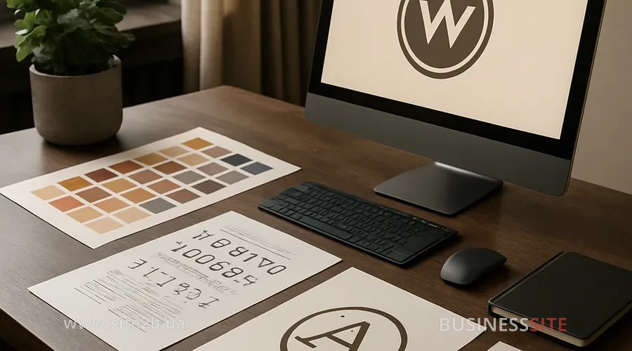
Components of the visual system
I always start with an inventory of the basic elements:
- Logo and its variations
- Primary, horizontal, vertical, monochrome versions; minimum size; placement rules on light, dark, and photographic backgrounds; a separate version of the logo for favicon and social preview.
- Brand color palette (HEX, RGB, HSL)
- Primary colors (brand color), secondary (accent), neutrals (background, surface, border), and system colors (success, warning, error). I immediately set up the color system for accessibility (WCAG contrast), so buttons and text remain readable even on low-cost screens and in bright light.
- Typographic system (web fonts, fallback)
- One or two primary fonts for headings and body text + fallback fonts that render correctly on any device. Sizes, spacing, and hierarchy of headings and text: the basis of the Visual Hierarchy, which directly affects conversion.
- Iconography and pictograms
- Grid system (for example, 24×24 px), line thickness, style (outline, filled, duotone). For online stores and services in BUSINESS SITE we often built modular iconography: simple, easily scalable shapes in SVG icons with a unified logic.
- Photostyle and brand photo libraries
- Rules for choosing angles, lighting, color, emotions; ban on “impersonal stock”, emphasis on real people and products. For pharmaceutical companies and e-commerce projects we established image governance: which types of photos are acceptable, how to store and tag them in the library.
- Illustrative style and 3D components
- When a business uses illustrations or 3D, I define principles: level of detail, color, perspective, permissible animations. This reduces the risk of a “style zoo”, especially when different contractors work on the materials.
- Microinteractions and animation (microinteractions)
- Animations for hovers, clicks, loaders, notifications. It’s important to maintain balance here: enough liveliness to increase engagement and clarity, but without losses in Core Web Vitals.
How to prepare the brand platform before design

Any visual system that is created without a strategy will sooner or later start to conflict with marketing and sales. Therefore, before design I always align with the owner in terms of the Brand Platform.
- value proposition (how you differ from competitors),
- key audiences and their motivations,
- the desired Tone of Voice and visual tonality,
- business‑KPI: which metrics should grow after the visual update (conversion, LTV, Brand Recall, Brand Consistency Score).
Brief, moodboard, tone of voice: examples
- Brief
- Document where we record goals, audience, pain points, competitors, technical constraints (CMS, backend, integrations with «PrivatBank», «Monobank», «Nova Poshta», etc.). This is the basis for a cost‑benefit analysis: what exactly investing in visual identity gives the business.
- Moodboard
- A visual reference board: websites, interfaces, fragments of UI kits, photo style. Here I achieve stakeholder alignment – so that the owner, marketing and designers see the same direction.
- Tone of Voice document
- A brief description of how the brand speaks: formal or conversational, with humor or strict, using informal (“you” familiar) or formal (“you” polite) address. I link the Tone of Voice and the visual language: a bolder tone allows a more contrasting palette and dynamic composition; a strict one – rational, calm.
Creating a web guide and brand book for a website

As the essential minimum of a web brand book, I include:
- rules for using the logo on the website and in the interface,
- the brand color palette for the website with examples for buttons, links, backgrounds, notifications,
- a typography guide for the site (fonts, sizes, spacing, module examples),
- examples of using the brand’s iconography for the website,
- templates for main modules: header, footer, product card/service, forms, CTA blocks,
- rules for using photos and illustrations in the interface.
Brand book template: structure and examples
I arrange the typical structure as follows:
- Overview: brief information about the brand and the goals of the visual system.
- Logo: variations, clearspace, minimum size.
- Color: palette with HEX, RGB, HSL codes, usage examples and contrast levels (WCAG).
- Typography: fonts, hierarchy, use cases for headings, body text, buttons.
- Icons and illustrations: grid, styles, do’s and don’ts.
- UI patterns: buttons, forms, cards, tables, error messages.
- Page examples: homepage, category, card, landing page.
- Visual QA checklist and versioning rules: how to record changes, release notes for updates.
Design system: speeding up implementation
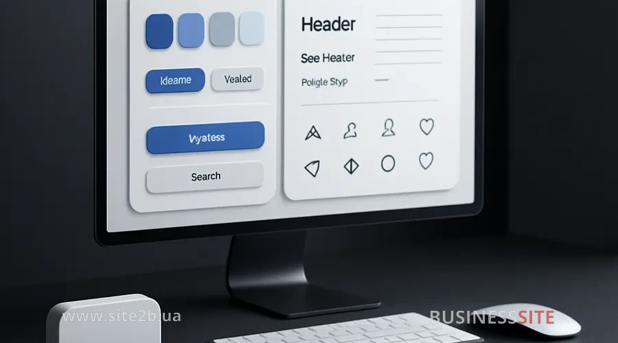
- speed up the launch of new landing pages and promo pages,
- reduce the number of edits and conflicts between marketing and development,
- maintain visual consistency when working with external agencies.
What to include: design tokens, components, Storybook, Figma
My practical minimum:
- Design tokens (design tokens)
- Variables for colors, typography, spacing, shadows, radii. In JSON or YAML format, versioned using SemVer. It’s a bridge between design and code.
- Component library (Figma/Sketch/Storybook)
- In Figma I assemble a UI kit and page templates; in Storybook – a live library of React/Vue components. The Atomic Design approach helps separate atoms (buttons), molecules (forms), organisms (product cards, header).
- Component-driven development
- Developers integrate ready-made components instead of coding each landing page from scratch. This consistently reduces time-to-market and the number of bugs.
Web performance and accessibility techniques
Asset recommendations
I follow these rules:
- Image formats: AVIF/WebP/PNG
- Product photos and banners: in WebP or AVIF with responsive srcset for different screens; PNG for transparent logos where sharpness matters; JPEG only where newer formats are not supported.
- SVG icons and vector graphic optimization
- Icons and simple illustrations: in SVG with optimization (removing unnecessary attributes, merging paths). Sprites and lazy-loading for graphics reduce the load on the Critical Rendering Path.
- CDN and asset optimization
- Hosting static brand assets (fonts, images, JS/CSS) on a CDN reduces response time. For projects with traffic across Ukraine this is especially noticeable.
How to integrate design tokens into CSS
- modular CSS / CSS Variables, in which web design tokens are embedded,
- feature flags for gradually enabling new visuals,
- visual regression testing (screenshot tests) to track unintended changes.
Adaptive brand identity for mobile websites
Specific patterns
I implement:
- responsive grid with container queries, so content reads well on both smartphones and wide monitors;
- scalable type: a typographic system where font sizes depend on screen width while preserving hierarchy;
- web fonts + fallback, optimized for different pixel densities;
- icons with sufficient touch‑targets (minimum 44×44 px).
Visual constants for marketing
I recommend using the same visual constants:
- palette,
- typography,
- basic UI patterns (button, form, card styles),
- photographic style.
Playbook for seasonal campaigns
So that marketing can quickly launch seasonal and promo landing pages, I create a short playbook:
- which elements may be changed (additional colors, illustrations, special icons),
- which elements remain unchanged (logo, basic buttons, typography),
- who approves deviations (governance and rules for modifying the identity),
- how to work in distributed and remote teams (strategies for implementing the brand book in remote teams).
Implementation plan and checklist
Basic plan:
- Audit of the current website and assets.
- Creating a UI‑kit and design system.
- Pilot deployed section or landing page (for example, the key product).
- Phased migration of the remaining pages.
- Team training (marketing, content, development).
Rollout plan and rollback
- use feature flags to roll out the new visual to a subset of users,
- plan a rollback in case metrics temporarily drop,
- provide a vendor onboarding checklist for agencies and contractors,
- organize Training & Onboarding: video‑guides, internal wiki, short workshops.
Metrics and ROI of visual changes
- Conversion Rate and micro-conversions (clicks on CTAs, funnel transitions),
- LTV (Lifetime Value): how the average revenue per customer will change after improving UX and visual consistency,
- Brand Equity and awareness: Brand Recall, Brand Consistency Score,
- analytics of UX and engagement metrics: page depth, time on key pages, scroll‑depth,
- Core Web Vitals: LCP, FID, CLS.
A set of practice tests
- A/B testing of visual hypotheses on the landing page (button color, block arrangement, typography),
- MVT (multivariate testing) for complex interfaces,
- visual regression testing so that releases don’t ‘break’ the visuals on older pages.
Quality control and brand identity protection
Key elements:
- clear rules for modifying the brand identity,
- regular design reviews and quality control processes,
- protection of visual assets: rights control (licensing) for fonts, photos, illustrations, watermarking where it’s critical.
Governance tools and metrics
- Governance Metrics: compliance rate (percentage of materials complying with the guidelines), visual QA pass rate, adoption rate of the new library,
- Figma library governance: editing rights, approval workflows, change log,
- versioning and release notes for key components.
Typical mistakes of small businesses
- «rebranded» the website, forgetting about email, social media and offline materials;
- used too many different fonts and colors;
- overloaded the interface with heavy images and scripts, which hurt loading speed;
- ignored accessibility (low contrast, small text).
Fix checklist
To quickly improve the situation, I recommend:
- optimize brand images for loading speed of the site (formats, compression, lazy‑load),
- unify typography to 1–2 fonts and a clear hierarchy,
- define a minimal web‑style guide for at least 5–6 pages,
- introduce visual QA and checklists before the release of each new landing page.
Case studies
Case: online store of mass-market goods
Case 2: local network of services
Case B2B‑SaaS
Practical templates and resources
- a basic UI-kit and page templates (homepage, category, product page, landing),
- a component library (Figma/Sketch/Storybook) with documented states,
- a starter set of design tokens for the web (colors, typography, spacing) in JSON format, ready for frontend integration,
- a deployment checklist for developers and marketers.
FAQ: short answers to frequently asked questions
Impact of the brand visual system on conversion and LTV for small businesses
How much does a brand book for a website cost?
How can you minimize risks when implementing a brand identity?
How do you implement design tokens in the frontend?
Which KPIs should you track after a website redesign?
How to adapt brand identity for seasonal campaigns?
Trade-off between visuals and site speed
Processes and roles of the visual system
Glossary of key terms
- Design tokens — values of visual parameters (color, font, spacing) represented as variables for code.
- Atomic Design, an approach to interface design “atoms → molecules → organisms → templates → pages”.
- Storybook: a tool for documenting and testing UI components in isolation.
- Visual regression testing: automated comparison of interface screenshots across versions.
- Brand consistency score – a metric that indicates how closely materials adhere to the brand guide.
- Design System Governance: a set of rules and processes for maintaining the design system.
- Core Web Vitals (LCP, FID, CLS): key metrics for loading performance and interface stability.
- Performance Budget – limits on page, script, and image sizes.
- Component Library: a set of reusable UI components with documentation.
- Feature flags – a mechanism for conditionally enabling or disabling functionality and visuals.
Checklist before visual release
Before each major release I go through three areas:
- Tech and performance
- LCP, FID, CLS in the “green” zone.
- Optimized images (WebP/AVIF, srcset, lazy-load).
- SVG icons and minimizing unnecessary scripts.
- Visuals and accessibility
- Correct use of the logo and color palette.
- Text contrast per WCAG, readable font sizes.
- Consistent typography and iconography.
- Governance and risks
- Updated brand guide and UI kit are available to the whole team.
- A rollback plan is documented and feature flags are active.
- Owners assigned for visual QA and library updates.
Conclusion and CTA
Rate the article: