Effective website design is not just a pretty picture. It’s a powerful tool that influences user behavior, directly impacting engagement, trust, and, consequently, conversion. According to research, users form their first impression of a website in just 50 milliseconds, and 38% of visitors leave if they find the layout unappealing or inconvenient.
That is why at BUSINESS SITE agency, we place particular importance on the psychological aspects of visual content perception. One of the most effective approaches is using gestalt principles in web design. These principles allow us to create interfaces that are intuitively understandable, visually structured, and direct user attention where the business wants it.
In this article, we will break down the key gestalt principles and show how they help improve user experience and influence audience behavior. If you want your site to be effective, not just “appealing” — be sure to read it to the end.
Gestalt Theory of Perception – What is it?
Gestalt theory is based on the idea that “the whole is greater than the sum of its parts.” Our brain strives to see organized, holistic images, even when faced with a set of disparate elements. This feature of human perception underlies gestalt psychology, which originated in early 20th century Germany.
In the context of website development, gestalt principles help create intuitive interfaces that users perceive naturally and effortlessly. I often explain to clients: imagine your website is not a collection of buttons, texts, and images, but a unified organism where each element works towards a common goal.
For example, in one of our projects for an electronics retail chain, we applied gestalt principles to redesign the product catalog. The result exceeded expectations: user time spent on the page increased by 27%, and conversion rate increased by 18%. And this was without changing the content — only through the proper organization of visual elements.
Perception Principles in Web Design
Proximity principle.
The proximity principle states: objects placed close together are perceived as related. At BUSINESS SITE, we actively use this principle in interface design. By grouping related elements and separating them from other groups, we create a visual hierarchy and help users navigate the page faster.
Recently, we worked on a website for a logistics company. By applying the principle of proximity to the service block, we visually combined related delivery options, helping clients quickly find the information they needed. As a result, the number of inquiries increased by 23%.
Similarity principle.
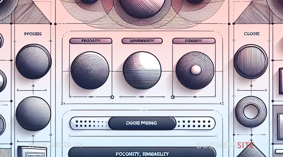
Elements with common visual characteristics (color, shape, size, texture) are perceived as related. This principle is especially useful in creating navigation and categorizing content.
In my practice, there was a case where a large online store client complained about a low purchase completion rate. Analysis showed that the buttons “Add to cart,” “Buy now,” and “Wishlist” were too similarly styled. We redesigned the interface, applying the similarity principle more consciously: the primary action (purchase) was highlighted with a bright color, and secondary actions with less noticeable shades. This led to a 15% increase in conversion.
Closure principle.
Our brain seeks to “close” or complete unfinished forms, seeing them as whole objects. This principle allows creating minimalist yet understandable interfaces.
At BUSINESS SITE, we often use the closure principle when designing logos and icons. For example, for a client in the financial technology sector, we created a set of icons where some lines were deliberately interrupted. Yet users easily perceived them as whole symbols, allowing for a more modern and lightweight design.
Figure-ground principle.
This principle is based on the ability to distinguish an object (figure) from its surroundings (ground). In web design, we use it to guide user attention, highlighting important elements and creating visual accents.
While working on the site for “Oxibank,” we applied this principle to the loan application form. The form was placed on a contrasting background, making it visually stand out. As a result, the number of completed applications increased by 32%.
Symmetry principle and its effect on user experience
Symmetry creates a sense of order and stability, helping to eliminate visual chaos. Information presented in a balanced manner is easier to perceive and remember better.
However, sometimes deliberate asymmetry can be an effective technique for attracting attention. In one of our projects for “Nova Poshta,” we used asymmetrical placement of a key element — the tracking button. This made it more noticeable and increased its usage frequency by 28%.
How Gestalt Principles Enhance Website Design
Gestalt principles directly influence how users interact with a site. Proper application of these principles makes the interface intuitive, reduces cognitive load, and improves the overall user experience.
At BUSINESS SITE, we regularly conduct A/B testing to evaluate the effectiveness of various design solutions. One of our experiments showed that a page designed with gestalt principles had a 24% lower bounce rate and a 17% higher user engagement level.
Visual hierarchy determines the order in which a user perceives information on a page. By combining different gestalt principles, we create a clear structure that guides users’ gaze from the most important elements to less significant ones.
For the online store “Akon”, we applied a combination of proximity and similarity principles in designing product cards. Key information (name, price, rating) was grouped and highlighted, helping users make purchasing decisions faster. Conversion increased by 21%.
Examples of Using Gestalt Principles in Web Design
One of the most striking examples from our practice is the redesign of a website for a travel company. We applied:
Proximity principle for grouping tours by direction
Similarity principle for visually highlighting special offers
Closure principle in the design of service icons
Figure-ground principle to emphasize the search form
Time spent on the site increased by 35%, and the number of bookings grew by 42%.
Features of Applying Gestalt Principles in Mobile Design
Mobile devices have their own specifics that need to be considered along with the Mobile First principle when applying gestalt principles. The limited screen space requires an even more meticulous approach to element organization.
At BUSINESS SITE, we have developed our own methodology for adapting gestalt principles to mobile interfaces. For example, the proximity principle on mobile devices requires more precise separation of element groups to compensate for the smaller screen size.
On mobile devices, users particularly value simplicity and intuitiveness in interfaces. Gestalt principles help create a design that “guides” the user on how to interact with the application.
Conclusion
Gestalt principles are not just design tricks but a powerful tool for influencing user perception and behavior. They allow transforming a site into an understandable, logical, and visually comfortable environment, where every decision — from element placement to accents and navigation — works towards business goals.
I am convinced that the role of gestalt principles in web design will only grow. With the development of virtual and augmented reality technologies, new opportunities for applying perception psychology are emerging.
At BUSINESS SITE, we are already experimenting with applying gestalt principles in VR interfaces. For instance, the figure-ground principle takes on a new dimension in three-dimensional space, allowing for a more immersive user experience.
At BUSINESS SITE agency, we systematically integrate these principles into our work on interfaces, enabling us to increase engagement, reduce bounce rates, and significantly boost conversion without changing the content.
If you want your site not only to look stylish but also to work effectively — start with the basics of perception. And if you need a team that knows how to turn psychology into results — you already know where to go. Additional Resources and Links
For those who want to deepen their knowledge of gestalt principles in design, I recommend a few resources:
“Laws of UX” — an online resource dedicated to psychological design principles