For example, you have a law firm that provides a range of services in different areas of law. You launched Google contextual advertising or a Facebook ad campaign. The page where the user lands after clicking on the ad is your landing page. That is, those who are potentially interested in your offer come to your landing page.
When a person sees on the page what they were promised in the ad, and there is enough information to complete the target action, clearly presented, they are more likely to move on to the next level of the sales funnel if they are genuinely interested.

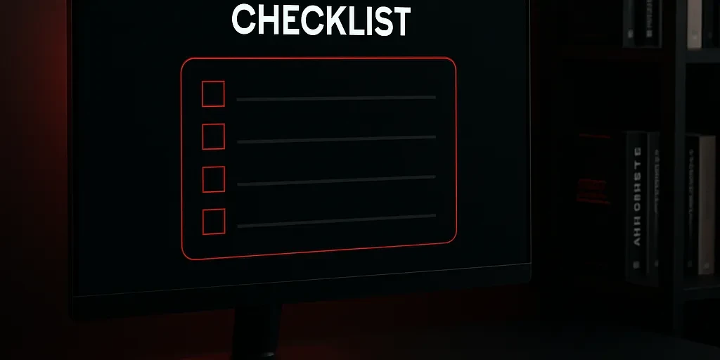
A Landing Page Must Be User-Friendly
According to research conducted by Data Insight analysts in collaboration with the IDRF’2020 organizing committee, modern users prioritize ease of selecting and finding a product online over low prices. Therefore, it is crucial to make landing pages simple and intuitive, which gives higher conversion rates than flashy promises of cheapness and confusing verbose offers with unclear benefits. Loud calls like “buy now” or promises of 100% guarantees no longer work, just as other clichéd phrases that yielded high conversion rates 5 or even 10 years ago no longer do.

The main goal when developing a landing page is to make it clear to the target user, as it is crucial that the offer on the landing page interests the person immediately—in the first few seconds. Otherwise, they will leave and are unlikely to return.
Rules for Creating Effective Landing Pages
When developing a landing page, strive to make it relevant to the audience’s expectations, clear, and convenient for completing the target action. Of course, it’s also important to stand out from competitors, be memorable, and differentiate yourself with design, simplicity, and accessibility of information, as well as the selection and price of the offer.
Relevance
When you advertise a specific product or service, the user should land on a page dedicated to that specific product or service after clicking the link in the ad.
For example, if you advertise an iPhone 12, the user should land on a page about the iPhone 12, not the entire Apple product catalog. Or if you advertise an accident support service, direct the user to a page that describes this service, not the homepage of your law firm’s website.
Therefore, if you want to drive traffic from different ads to one landing page, try setting up a multi-landing page where specific blocks change depending on which ad the user clicked on.
Clarity
Speak to your audience in their language and ensure that there is no ambiguity in any phrase on the landing page. The simpler and more accessible the language, the higher the level of trust and the greater the effect of a friendly message, and a friend can be trusted.
Clarity is needed everywhere, starting with the headline. Phrases like “We will help you” or “Check out our offer” don’t work. Such headlines do not explain the essence of the offer and contradict the promises made in the ad, which creates the same feeling of deceit and the desire to close the page.
- If you supply gravel, just write: “Gravel supply”
- If you do office cleaning, write – “Office cleaning”
The headline should be accompanied by an image to grab the attention not only of those who carefully read the headlines but also of everyone else. Where it says “Gravel supply,” there should be a picture of gravel, and where it says “Office cleaning,” there should be an image of office cleaning—ideally your own photos, not overly polished stock images. Stock photos no longer attract or surprise anyone.
It’s also a good idea to include the cost and real numbers on the landing page. For example: the number of satisfied customers or the number of days required to provide the service (if you are confident that this gives you an edge over your competitors).
Convenience
Place the main benefit or advantage of working with your company at the very top of the landing page. This will grab the client’s attention and motivate them to choose your offer.
For example:
- “Gravel supply at factory prices”
- or “Gravel supply on the same day”
- or “Gravel supply with deferred payment”
- or “Gravel supply with free delivery”
Numbers work well at the top of the landing page. This could include the number of clients, how long the company has been in business (if it’s only a few weeks or months, it’s better not to emphasize this at all), how many specialists work in the company, and any other achievements that look substantial, inspire confidence, and create a sense of being part of something important and significant.
Of course, it’s not enough to just keep the user on the page; it’s important that they take the next step in the sales funnel:
- make a call;
- submit a request via the form;
- write in the chat;
- send an email.

To do this, you need to ensure convenience:
- make buttons clear with unambiguous text,
- minimize the number of fields in forms,
- simplify navigation on the page,
- offer several options for completing the target action.
What must be implemented on the landing page:
- Clearly and concisely describe the essence and benefits of the offer. Why is your offer better than those of dozens or even hundreds of competitors? What makes it unique/beneficial, etc.?
- List the advantages of the product and the advantages of working with your company specifically. These should not be generic phrases; only write facts: numbers, names, years, titles, etc.
- Include descriptions of projects that have succeeded thanks to your product (case studies, portfolios). Successful case studies are a very effective tool that clearly shows that if a client turns to you, they will get a result on par with the example and be satisfied with their choice.
- Include testimonials. It’s best to present these in video format, but testimonials on company letterheads with your clients’ stamps and signatures will also make a good impression.
- Guarantees. Specify the guarantees your company provides, even if they are standard under the law, still include them. It would also be helpful to publish scans of documents that confirm these guarantees (quality certificates, company charters, partnership agreements, etc.). As we mentioned earlier, empty, unsupported guarantees do not work.
- Call to Action – CTA*. Naturally, the landing page should include CTA elements designed for an audience at different stages of readiness to purchase.
Examples of call to action for a landing page:
- A “request a call” button;
- A call to fill out a form;
- A personalized message in a pop-up or integrated chat;
- An invitation to write via email, chat bot, Skype, Viber, or other messengers;
- A button leading to payment for the product/service.
The Mobile First Principle in Landing Page Development

The essence of Mobile First is that developers and designers initially focus on the needs of mobile users, considering their limited screens, touch interfaces, and often less stable internet connections. This allows for the creation of a simplified yet effective design that provides quick access to essential information and key site functions. The design is then scaled up, adding additional elements for larger screens.
Each year, the number of users who prefer mobile devices for internet access grows.
A landing page developed using the Mobile First principle takes into account the characteristics of mobile user behavior and ensures optimal interaction, positively impacting conversion rates.
For entrepreneurs, this means that ignoring mobile traffic can lead to the loss of a significant portion of potential customers. After all, if the site is inconvenient on a mobile device, the user is likely to leave it in search of a more user-friendly option.

Key Elements of Mobile First Design
- Content and its optimization. When creating a mobile version of a landing page, special attention should be paid to content. It’s important to avoid cluttering the pages with unnecessary elements so that users can quickly find the information they need. A minimalist design with a focus on key elements helps achieve this goal.
- Page loading speed. Page load time directly affects the user experience. Optimizing graphics, using modern image formats, and minimizing scripts help significantly speed up loading, which is especially important for mobile users with limited internet access.
- Intuitive navigation. Simple and clear navigation is one of the key factors in successful Mobile First design. Drop-down menus (hamburger menus) and large, easy-to-tap buttons allow users to easily navigate the site without wasting time searching for the desired sections.
- CTA (Call to Action). CTA buttons should be placed in a visible and accessible area so that the user can easily complete the target action. This is especially important on mobile devices, where every second and every click counts.
Implementing Mobile First in Practice
- Testing and debugging. Testing on real devices allows you to identify and fix any display and functionality issues on the site. Using tools like BrowserStack helps ensure that the site works correctly on all types of devices and under various conditions.
- Adaptation for different screens. Responsive design ensures correct content display on screens of all sizes, from smartphones to desktops. This allows users to have a consistent experience interacting with the site, regardless of the device.
- Examples of successful mobile landing pages. Many successful companies have already implemented the Mobile First approach, significantly increasing conversion rates and improving user experience. Examples of such solutions can serve as an excellent guide for your business.
Tips and Best Practices for Mobile First Design
- Avoid heavy elements. Optimizing images and minimizing the use of heavy scripts significantly speeds up page loading, which is especially important for mobile users.
- Focus on core content. The main content should be accessible and easy to understand on mobile devices. This will help the user quickly find the necessary information and complete the target action.
- Testing on real devices. Checking the site’s performance in real conditions is a key stage in developing according to the Mobile First principle. This ensures that the site is truly convenient and effective on all types of devices.

What Affects the Cost of Creating a Landing Page
The cost of creating a landing page is determined by the amount of time required for its development. This amount is based on the business tasks set and the cost of the specialists’ time, which is influenced by their qualifications and demand.

To understand pricing, let’s look at the process and main stages of creating a sales-oriented landing page.
- Marketing
This is the stage where the logic of presenting the content of the landing page is developed, the main advantages, strong points of the product, and capture points are worked out, and a prototype (a schematic visualization of the page) is created. Competitor page analytics are conducted. The task of marketing is to make you stand out among competitors, emphasize advantages, and find tools that indicate that contacting you is the right choice. - Copywriting
At this stage, all the texts for the site, including sales headlines and descriptions, are created. Texts are a very important component of any site, as they need to convey the value of your offer. The copywriter’s task is to create very concise and easily understandable formulations, while also enriching the texts with keywords so that search engines consider your landing page relevant. Creating a separate section on the site for an expert blog is also a great idea. In the blog, you can post useful articles for site visitors and regular clients. A content writer may also work with an SEO specialist to optimize the page and add keywords that will be successfully indexed by search engines. - Design
At this stage, the site elements acquire form and properties. The valuable end product of the “website design” stage is not only to achieve attractiveness and aesthetics. It is important to highlight and emphasize the meanings embedded in the “marketing” and “copywriting” stages. This means that the graphic design should highlight important points written in the texts, complement them with images for completeness and simplicity of perception. It’s essential that the designer strikes a balance between attractiveness and usability and implements the marketer’s ideas in the design. - Coding and Programming
No matter how great the idea for your landing page is, no matter how thoroughly the marketer has analyzed the target audience, no matter how subtly the designer has approached visualization, all these efforts can be completely ruined by “poor” HTML coding or incorrectly functioning software modules. At this stage, the professionalism of the developer matters:- They will fully replicate the landing page layout designed by the designer.
- Ensure correct page display in all popular browsers (cross-browser compatibility).
- Adapt the page for mobile, tablet, and desktop devices (page adaptability).
- Program the correct functioning of all forms and buttons on the page.
- TestingThe Quality Control Department specialist checks the functionality of the completed landing page. Testing helps ensure the site displays correctly on all types of devices and the forms and interactive elements work properly. At this stage, the following are examined:
- Functionality of the landing page (contact forms, counters, interactive elements).
- Coding. Checking the validity of the code, display in different browsers, on tablet screens, and mobile devices.
- Usability. Assessing the convenience of using the resource from the user’s point of view.
- Performance. How quickly the page loads and how many users can perform actions on the site simultaneously.
- Website security.
How to Create a Technical Assignment for Landing Page Developers
A technical assignment (TA) is a document that regulates the completion of a task by a contractor on behalf of a client. A properly written TA should contain comprehensive information about how the client envisions the creation of a landing page.
To create a TA, it’s best to use the brief questionnaire provided by the contractor. The questionnaire will guide you in providing exactly the information needed to develop a landing page. Request a brief for creating a landing page from Business Site’s web studio right now. If you are writing the TA yourself, be sure to include the following information:
- Basic information about the company’s activities,
- Information about the product or service being promoted,
- The advantages of your offer over competitors’,
- Description of the target audience,
- Information about competitors,
- Design, functionality, and content requirements and preferences,
- Information about what you want to see on the site and what should be avoided during development.
Landing Page Design Requirements
Template design in the 2020s is a clear sign that a business is economizing on online promotion. Moreover, design in the mass-market e-commerce segment is what allows you to stand out among thousands of stores with similar assortments. A quality design is a harmonious combination of colors, detailed elaboration of every element (buttons, contact forms), and easy navigation.
It’s best to publish your own high-quality photos on the landing page. Rather than spending money and time on stock photos, it’s better to organize a photoshoot and get professional images of your products, employees, production facilities, etc. The investment in a photoshoot will pay off quickly, and good photos will attract many more clients to your site.
Ultimately, the landing page should be attractive to the user, clear, informative, and easy to navigate between sections, if any.
Coding and Programming
Traffic to a landing page can come not only from direct advertising but also from search engines. To ensure that the landing page ranks highly in search results, pay attention to the following during coding and programming:
- The page should load quickly (Google has a convenient tool for checking page load speed);
- There should be no errors in the code;
- The page should display correctly in any browser, regardless of the screen size of the device.
- The page should be adapted for mobile versions of Android and iOS.
Form functionality also needs to be checked, ideally once a month or as soon as there are any suspicions that something has broken. Even a minor data transmission error from the form to the CRM or database can lead to losing a client or clients: the person fills out the form, but you won’t even know about it.
Landing Page Example

- Landing page header
The header of a sales page contains contact information and may include menu buttons and a callback request form. It is important that the header remains visible to the client, regardless of which section of the landing page they are viewing. Once they decide to take the target action, your visitor can immediately use the contact details to make a call.
- Images on the site The next important element on a landing page is a bright and high-quality visual presentation of the offer. The image must be unique, as search engines check all the content on the page. Non-unique content is downgraded, and even if the page has unique quality texts, the indexing results will be disappointing.
- Call to Action and Contact Form
The block with the contact form is always accompanied by a call to action. It can tell the result the client will get by ordering the offered product or service. It’s great if it’s a first-person story (from the client’s perspective) with a link to one of their social media accounts (with their consent). This will greatly increase trust in your company and product. It’s best to keep the number of fields in all forms to a minimum—only the most necessary ones so the client doesn’t spend too much time filling them out. For example: full name, contact phone number, email. Often, only a contact phone number is needed in the contact form. - Promotional BlockThe promotional and discount block encourages the visitor to take the target action. But it’s important to note that worn-out countdown timers and reminders about low stock work in far fewer niches. Therefore, when developing landing pages, Business Site specialists avoid template solutions and structure the page according to marketing goals.
Also, make sure there is consistency and logic in marketing promotions. Otherwise, if the site says that a discount is available until the end of the week, and the client returns a month later and sees the same information, trust will be lost immediately. - Listing Benefits The information in the benefits block should be structured, brief, and simple. Relevant icons for each benefit make the text easier to perceive visually. Keep in mind: “We are market leaders,” “We are number one,” “Only with us can you buy” are no longer advantages, but rather overused phrases.
- Trust Triggers The trust triggers block addresses customer objections and confirms the company’s credibility. Trust triggers can include client logos, scans of certificates and supporting documents, portfolios of completed work, numbers, and facts. Visualizing the sequence of the company’s work also strengthens trust. It’s best to present this as a clear diagram with minimal text.
- 7. Testimonials on the Site Testimonials on a landing page are intended to finally convince the client that they have made the right choice. It’s best to post real testimonials from your clients with their real names, photos, occupations, and even links to their personal social media pages (if they consent).
- CTA Elements The final block of any landing page is the call to action and CTA button.
Attracting Traffic to Landing Pages – Proven Methods: SEO, PPC Advertising
Developing a landing page is only half the battle. Immediately after the landing page or multipage site with individual pages for each product is ready, it’s time to start attracting traffic.

- SEO optimization of the site brings the website in line with current search engine requirements, helping to bring the landing page to the top of search results for free. Of all the methods of attracting visitors, SEO optimization is the most effective in terms of conversion. Only a person who has already decided to get this service soon might type the query “order outdoor advertising Kyiv” into the search bar. This means that when they land on your site, they are highly likely to take the target action—place an order.
SEO optimization is a long-term promotion strategy. It should be considered that the first results will take a couple of weeks to a few months. But at the same time, SEO optimization allows you to rank for the keywords you need for a long time, which means you can get new clients week after week and month after month. - PPC is a paid method of attracting visitors. It is implemented through the Google AdWords system and other ad networks with pay-per-click. This promotion method allows you to get results very quickly: a stream of clients to the landing page. The advantage of PPC is that you can get results immediately after launching the campaign. But there is also a downside—the traffic lasts only as long as there is a budget, and the ads are running; whereas the effect of SEO investments is cumulative.
Landing Page as a Lead Generation Tool
A good landing page helps businesses convert potentially interested people into leads. To make the landing page pay off and generate profit, you need to work with analytics, use different traffic sources, and test and optimize it, just like any other marketing tool.
We don’t just design and code the landing page; we create it based on the results of a marketing audit, the goals, and objectives of your business.
Rate the article: